Designing an amplifier
Ubiquiti Inc. is an American technology company that manufactures and sells IoT products for both enterprises and homes. During my time in UI, I led the development of a new audio product line, UniFi Play.
UX iterations
UX UI
Role and collaborations
Lead Designer, 0 to 1
Worked with hardware, firmware, & software teams in agile format
Background
While most advanced music applications have an equalizer (EQ) section, the truth is that most people don’t use them as they are way too complex.
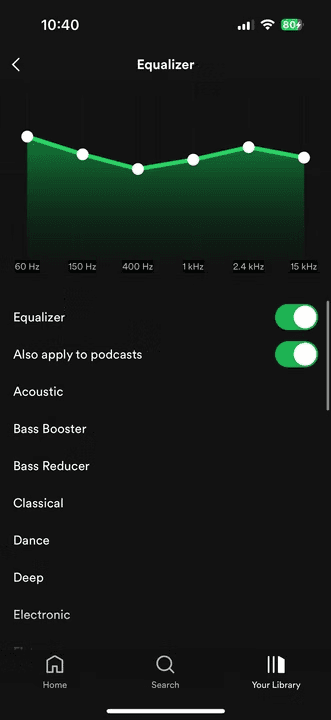
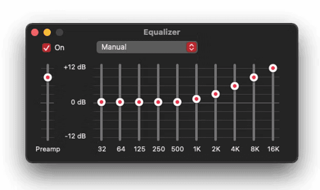
These are the EQs of Spotify & Apple Music.
How often have you adjusted these settings?
Proof of Concept
The initial idea was to launch something really basic with minimal effort.
"Let's launch the amplifier without any manually adjusted EQ as a start"
The Strategy Angle
However, this idea soon faced challenges from the marketing and strategy teams.
Hardware products only have one time to impress customers. This goes against the "MVP" concept we are familiar with.
Reason 1: Most high-end audio applications have them
Reason 2: Audio products should always offer an option for users to manually adjust EQ if they want to
Reason 3: Help to position us as a high-end audio amplifier from a marketing perspective
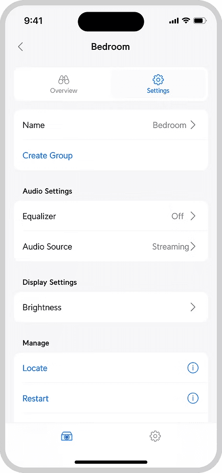
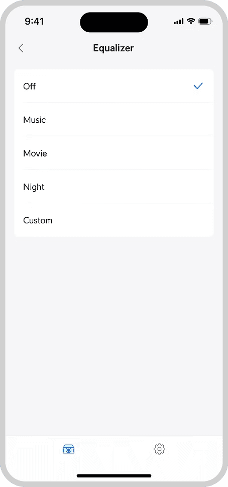
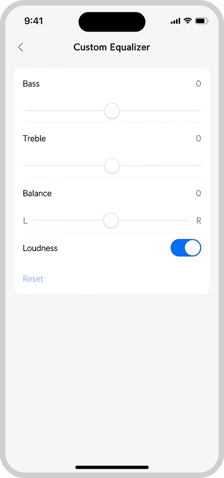
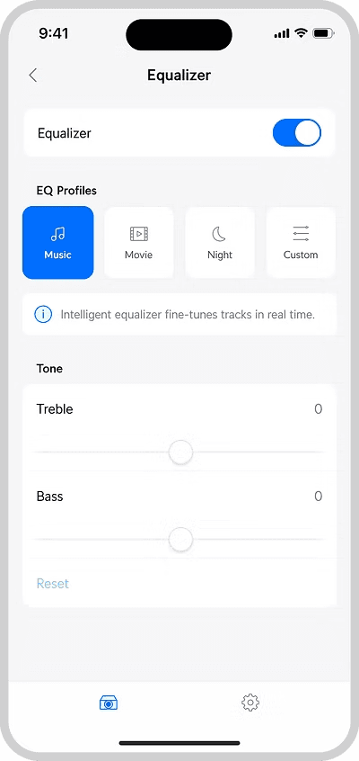
Version 1
While setting off with the new direction to create an advanced EQ feature, I took the opportunity to re-inspect our current design.
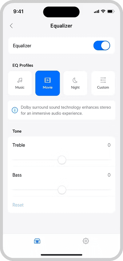
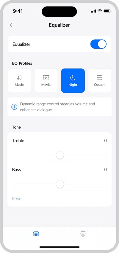
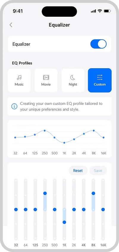
For the Music/Movie/Night APIs from Dolby, many products including our smart TVs at home do use these terms directly.
However, widely used terms ≠ everyone understanding what they mean.
Does the genre of music matter? Some EQs have specific genres like Pop/Rock/Jazz to select.
If I’m watching a movie at night, do I select "Night" or "Movie"?
What does “Night” exactly do?
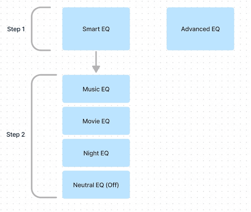
Previous layout
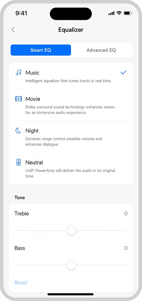
Smart EQ with one liner explanation
Advanced EQ in the next tab
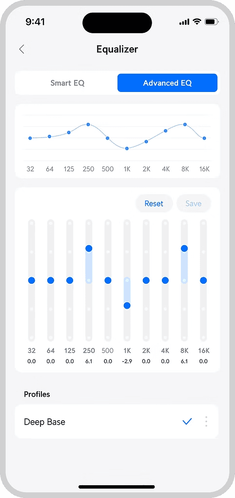
Continuous Iterations
However, there were flaws to the design and more could be done.
For example:
Can the vertical space be reduced to minimise scrolling?
Interactions between tabs were confusing as well
More importantly, as a user, can I not care about equalizers at all?
Information Architecture
At this point, I took a step back to rethink the feature's information architecture and user flow
Expected user flow
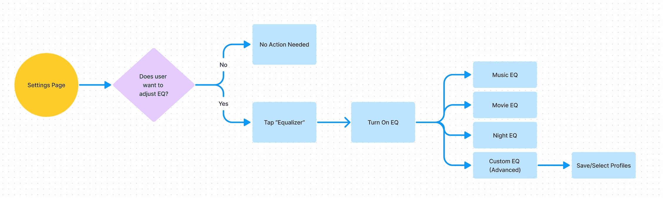
Current IA
Revised IA
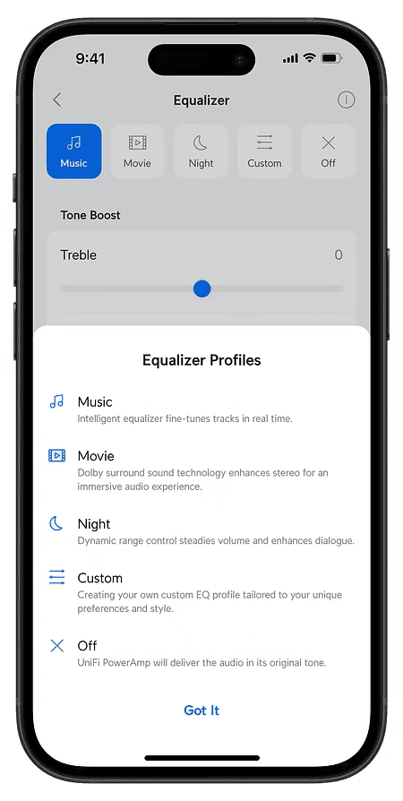
Version 2
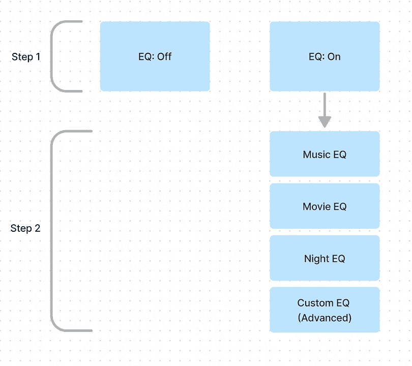
Square thumbnails + new information architecture
For example:
Can the vertical space be reduced to minimise scrolling?
Interactions between tabs were confusing as well
More importantly, as a user, can I not care about equalizers at all?
Stakeholder feedback
A big part of this project was stakeholder management.
As UniFi Play was a brand new product line, stakes were high as we only really had one chance to impress users.
The project was subjected to much scrutiny and quick iterations had to be made constantly, even when it sometimes did not make much sense on the product end.
"Can we make this area more compact?"
"I like the advanced EQ design. But can it be placed towards the top so users don't have to scroll?"
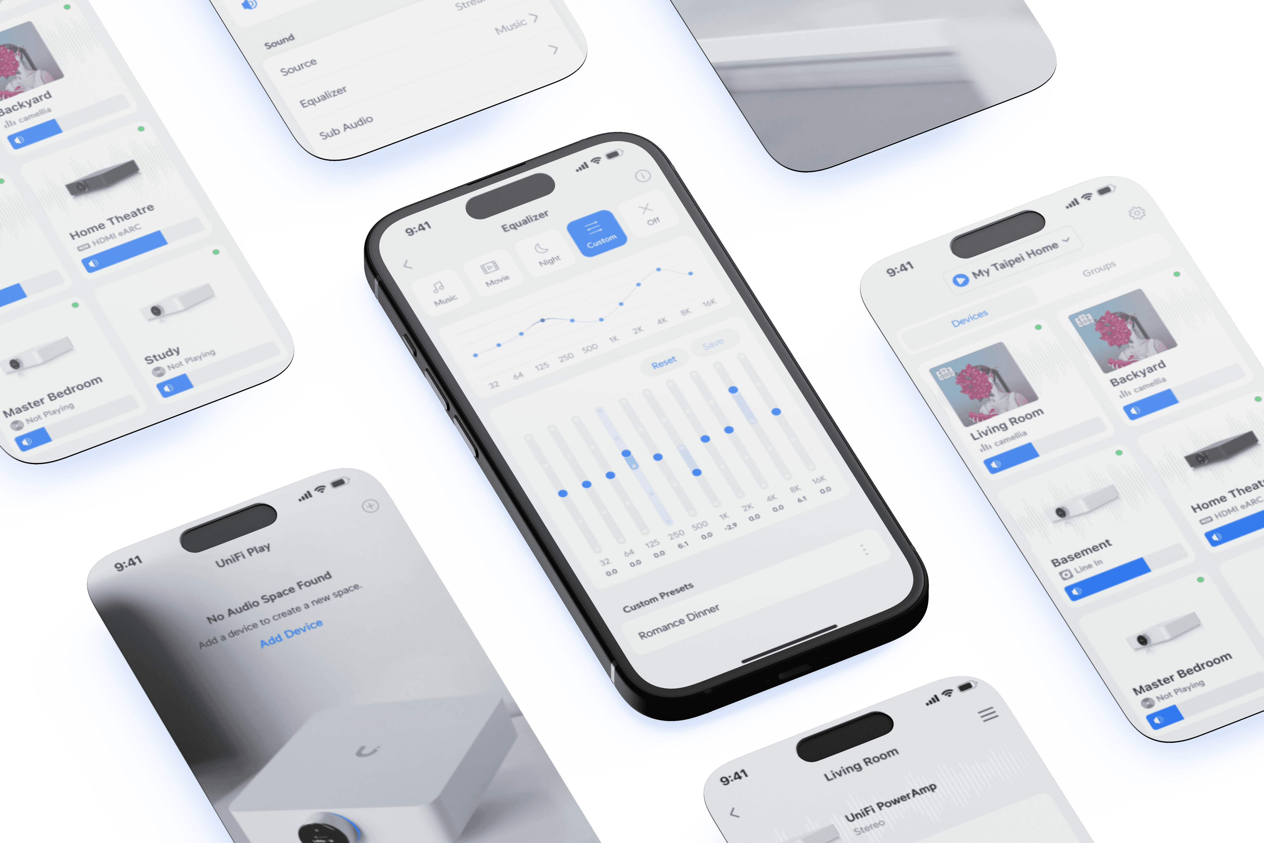
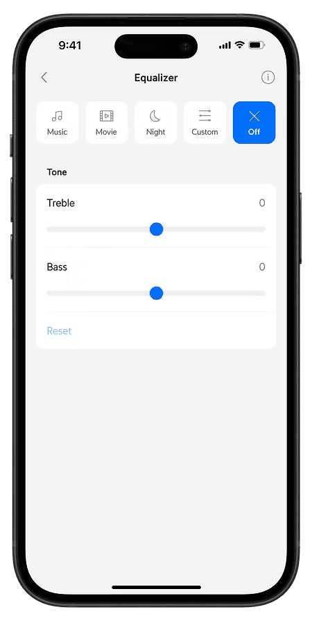
Finishing touches
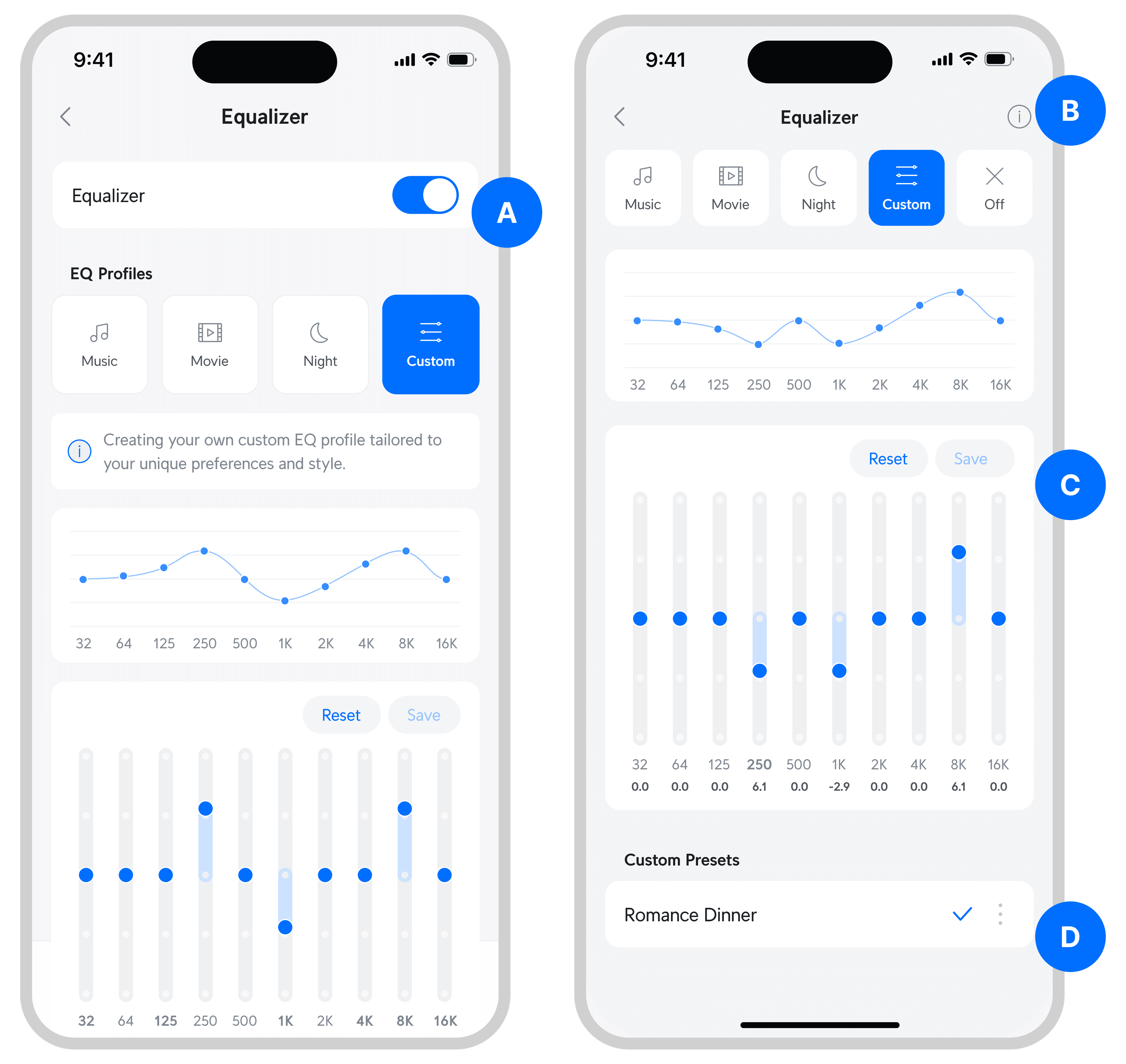
A
Removed on/off toggle and placed "off" alongside other profiles
--> Reduce vertical space
B
Combined tooltips into a "i" icon at the top right corner
--> Reduce clutter as tooltip box may be irrelevant after user become familiar with what each audio profile mean
C
Reset & save profile button
--> Helps user get to their desired equalizer configuration within 1 click
D
Kebab menu next to each custom profile
--> Enables user to edit and delete each profile
More Works
Designing an amplifier
2023 - 2024
End-to-end design
Product
Designing an amplifier
2023 - 2024
End-to-end design
Product

Designing for hardware / software integration
2024
UX UI
Phygital design
Designing for hardware / software integration
2024
UX UI
Phygital design

Unifying a fragmented banking platform
2025
Design systen
Accessibility
Shaping Disney’s digital experience in Asia
2025
UX UI
UX iterations
Designing an amplifier
Ubiquiti Inc. is an American technology company that manufactures and sells IoT products for both enterprises and homes. During my time in UI, I led the development of a new audio product line, UniFi Play.
UX iterations
UX UI
Role and collaborations
Lead Designer, 0 to 1
Worked with hardware, firmware, & software teams in agile format
Background
While most advanced music applications have an equalizer (EQ) section, the truth is that most people don’t use them as they are way too complex.
These are the EQs of Spotify & Apple Music.
How often have you adjusted these settings?
Proof of Concept
The initial idea was to launch something really basic with minimal effort.
"Let's launch the amplifier without any manually adjusted EQ as a start"
The Strategy Angle
However, this idea soon faced challenges from the marketing and strategy teams.
Hardware products only have one time to impress customers. This goes against the "MVP" concept we are familiar with.
Reason 1: Most high-end audio applications have them
Reason 2: Audio products should always offer an option for users to manually adjust EQ if they want to
Reason 3: Help to position us as a high-end audio amplifier from a marketing perspective
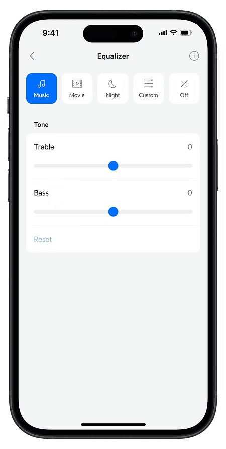
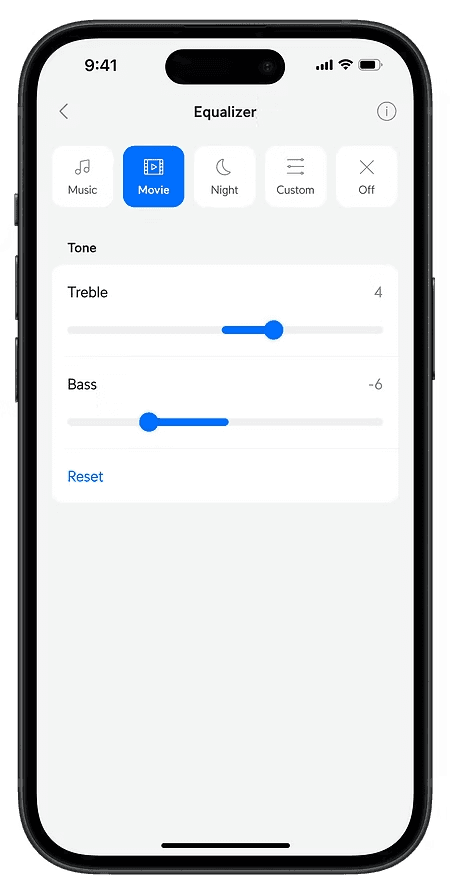
Version 1
While setting off with the new direction to create an advanced EQ feature, I took the opportunity to re-inspect our current design.
For the Music/Movie/Night APIs from Dolby, many products including our smart TVs at home do use these terms directly.
However, widely used terms ≠ everyone understanding what they mean.
Does the genre of music matter? Some EQs have specific genres like Pop/Rock/Jazz to select.
If I’m watching a movie at night, do I select "Night" or "Movie"?
What does “Night” exactly do?
Previous Layout
Smart EQ with one liner explanation
Advanced EQ in the next tab
Continuous Iterations
However, there were flaws to the design and more could be done.
For example:
Can the vertical space be reduced to minimise scrolling?
Interactions between tabs were confusing as well
More importantly, as a user, can I not care about equalizers at all?
Information Architecture
At this point, I took a step back to rethink the feature's information architecture and user flow
Expected user flow
Current IA
Revised IA
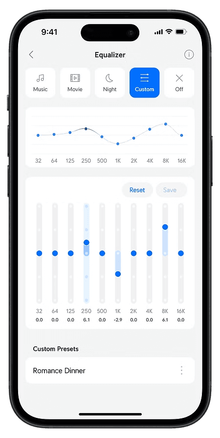
Version 2
Square thumbnails + new information architecture
For example:
Can the vertical space be reduced to minimise scrolling?
Interactions between tabs were confusing as well
More importantly, as a user, can I not care about equalizers at all?
Stakeholder feedback
A big part of this project was stakeholder management.
As UniFi Play was a brand new product line, stakes were high as we only really had one chance to impress users.
The project was subjected to much scrutiny and quick iterations had to be made constantly, even when it sometimes did not make much sense on the product end.
"Can we make this area more compact?"
"I like the advanced EQ design. But can it be placed towards the top so users don't have to scroll?"
Finishing touches
A
Removed on/off toggle and placed "off" alongside other profiles
--> Reduce vertical space
B
Combined tooltips into a "i" icon at the top right corner
--> Reduce clutter as tooltip box may be irrelevant after user become familiar with what each audio profile mean
C
Reset & save profile button
--> Helps user get to their desired equalizer configuration within 1 click
D
Kebab menu next to each custom profile
--> Enables user to edit and delete each profile
More Works
Designing an amplifier
Ubiquiti Inc. is an American technology company that manufactures and sells IoT products for both enterprises and homes. During my time in UI, I led the development of a new audio product line, UniFi Play.
UX iterations
UX UI
Role and collaborations
Lead Designer, 0 to 1
Worked with hardware, firmware, & software teams in agile format
Background
While most advanced music applications have an equalizer (EQ) section, the truth is that most people don’t use them as they are way too complex.
These are the EQs of Spotify & Apple Music.
How often have you adjusted these settings?
Proof of Concept
The initial idea was to launch something really basic with minimal effort.
"Let's launch the amplifier without any manually adjusted EQ as a start"
The Strategy Angle
However, this idea soon faced challenges from the marketing and strategy teams.
Hardware products only have one time to impress customers. This goes against the "MVP" concept we are familiar with.
Reason 1: Most high-end audio applications have them
Reason 2: Audio products should always offer an option for users to manually adjust EQ if they want to
Reason 3: Help to position us as a high-end audio amplifier from a marketing perspective
Version 1
While setting off with the new direction to create an advanced EQ feature, I took the opportunity to re-inspect our current design.
For the Music/Movie/Night APIs from Dolby, many products including our smart TVs at home do use these terms directly.
However, widely used terms ≠ everyone understanding what they mean.
Does the genre of music matter? Some EQs have specific genres like Pop/Rock/Jazz to select.
If I’m watching a movie at night, do I select "Night" or "Movie"?
What does “Night” exactly do?
Previous layout
Smart EQ with one liner explanation
Advanced EQ in the next tab
Continuous Iterations
However, there were flaws to the design and more could be done.
For example:
Can the vertical space be reduced to minimise scrolling?
Interactions between tabs were confusing as well
More importantly, as a user, can I not care about equalizers at all?
Information Architecture
At this point, I took a step back to rethink the feature's information architecture and user flow
Expected user flow
Current IA
Revised IA
Version 2
Square thumbnails + new information architecture
For example:
Can the vertical space be reduced to minimise scrolling?
Interactions between tabs were confusing as well
More importantly, as a user, can I not care about equalizers at all?
Stakeholder feedback
A big part of this project was stakeholder management.
As UniFi Play was a brand new product line, stakes were high as we only really had one chance to impress users.
The project was subjected to much scrutiny and quick iterations had to be made constantly, even when it sometimes did not make much sense on the product end.
"Can we make this area more compact?"
"I like the advanced EQ design. But can it be placed towards the top so users don't have to scroll?"
Finishing touches
A
Removed on/off toggle and placed "off" alongside other profiles
--> Reduce vertical space
B
Combined tooltips into a "i" icon at the top right corner
--> Reduce clutter as tooltip box may be irrelevant after user become familiar with what each audio profile mean
C
Reset & save profile button
--> Helps user get to their desired equalizer configuration within 1 click
D
Kebab menu next to each custom profile
--> Enables user to edit and delete each profile
More Works