Unifying a Fragmented Banking Platform
This was a project done during my time at frog, where I worked with Standard Chartered Bank to audit their corporate banking platform and incorporate accessible design
Design system
Accessibility
Project Overview
Client: Standard Chartered Bank
Role: Product Designer / Consultant (frog)
Engagement: Corporate Banking Platform Audit & Accessibility Compliance
Focus: Design system, governance, UX quality, accessibility
Duration: 5 months
I worked closely with Standard Chartered’s Corporate Banking design and product teams to assess and uplift their existing digital platform, with a focus on design consistency, usability, and accessibility compliance.
The Problem
Over years of incremental development and redesigns, SCB's corporate banking platform had evolved into a fragmented ecosystem built on three different design systems.
This resulted in:
Inconsistent user experiences across journeys
Increased design and development overhead
Difficulty maintaining quality and governance
Non-compliance with accessibility standards
The bank needed a clear, practical roadmap to modernise their experience without disrupting business-as-usual (BAU) operations.
My Role & Responsibilities
As a consultant embedded within the Corporate Banking design team, I worked in a team of 3 to
Conduct UX, design system, and accessibility audits
Conducting stakeholder and team interviews
Synthesising insights into actionable recommendations
Supporting governance and operating model improvements
Facilitating alignment across product, design, and leadership
I worked closely with product owners, designers, and senior stakeholders to ensure outputs were both strategic and implementable.
Our Approach
Three work streams existed in this project:
1. Experience Audit
Mapping and evaluating key journeys using usability heuristics.
2. Design System Audit
Reviewing every component, file structure, and governance process.
3. Accessibility Assessment
Manually testing critical templates against WCAG 2.2 AA.
This allowed us to understand both the user-facing and organisational challenges.
Key Design Activities
Stakeholder Interviews
We conducted interviews with product owners and designers across corporate banking functions to understand:
Existing ways of working
Friction and pain points
What success looked like
These conversations helped uncover misalignments between teams and highlighted opportunities for improved collaboration and ownership.
User Journey Audit
Using Jakob Nielsen’s 10 Usability Heuristics as a framework, we mapped and evaluated key user flows across the platform.
For each journey, identified breaks in consistency, unclear interactions, redundant patterns.
These insights formed the foundation for system-level improvements.
Design System Audit
We conducted a detailed audit of all components across web and mobile, including:
Component quality and usability
Duplication and inconsistencies
Alignment with the latest design system
Figma file structure and governance
Use of local vs shared components
We categorised each component into: Keep, Review, and Iterate.
This framework helped the team prioritise work and establish clearer ownership
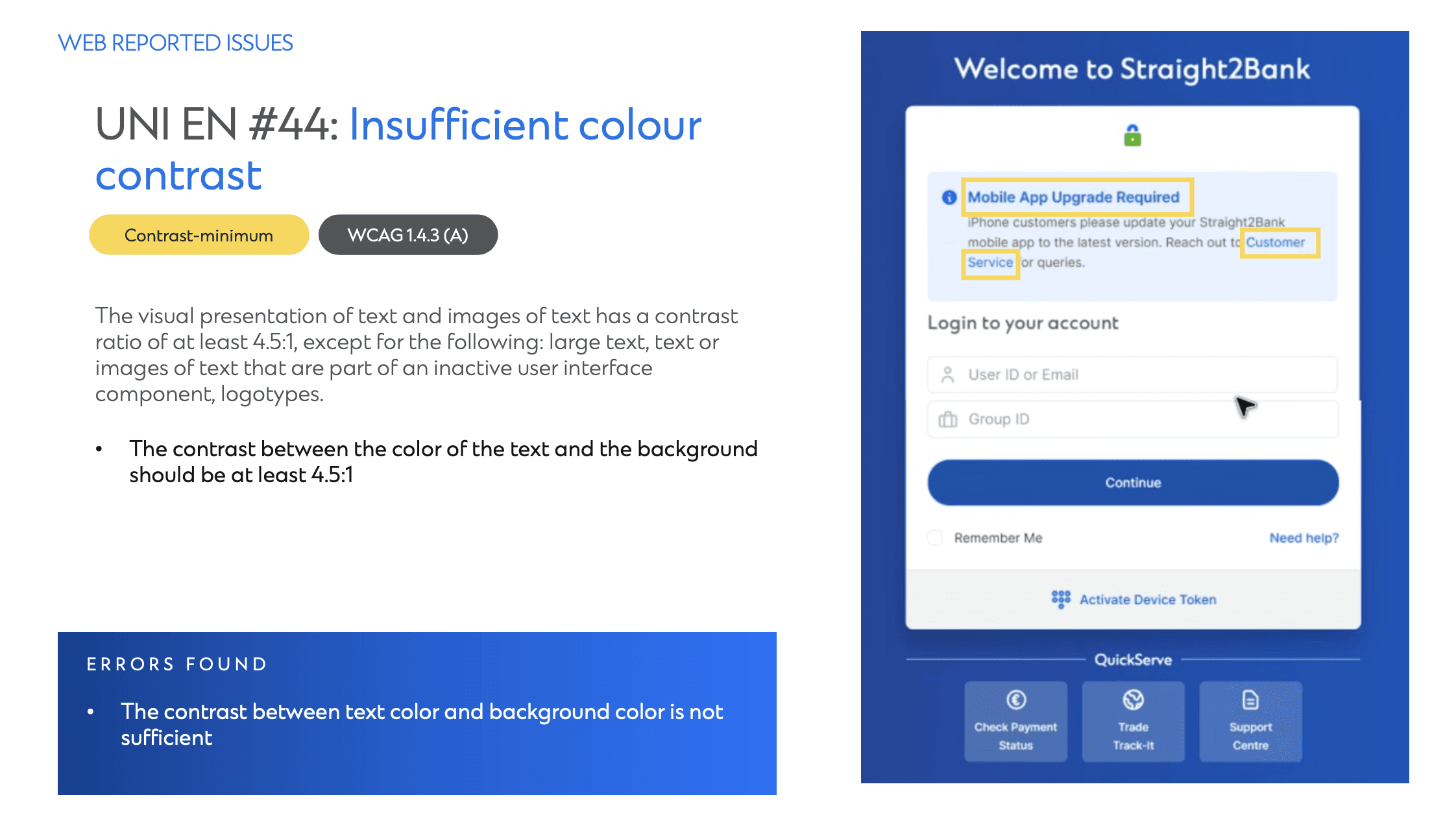
Accessibility Audit
To support regulatory compliance, 35–50 key templates and screens were manually evaluated against WCAG 2.2 AA standards. We prioritised high-impact user journeys to ensure the most critical experiences were addressed first.
The most critical piece
A major component of this engagement was aligning multiple teams around long-term improvements that required short-term investment.
This involved:
Facilitating difficult conversations around technical and design debt
Framing recommendations in business terms
Balancing ambition with operational realities
Building trust across design, product, and leadership
By positioning change as incremental and outcome-driven, we were able to gain buy-in for phased improvements.
Engagement Outcomes
The engagement resulted in several key outcomes:
A comprehensive UX, design system, and accessibility audit
A prioritised roadmap for design system uplift
Clear governance and ownership recommendations
An accessibility compliance improvement plan
Improved alignment across product and design teams
These outputs enabled Standard Chartered to begin modernising their platform in a structured, low-risk manner, while continuing to support BAU operations.
Learning & Reflections
This project strengthened my ability to operate at a systems and organisational level, where design quality is shaped as much by systems and culture as by individual screens.
Key learnings included:
The importance of framing design recommendations in operational terms when working in cross-functional teams
The role of diplomacy and facilitation in enterprise environments
How accessibility must be embedded into systems, not treated as a checklist
More Works
Shaping Disney’s digital experience in Asia
2025
UX UI
UX iterations
Shaping Disney’s digital experience in Asia
2025
UX UI
UX iterations

Designing an amplifier
2023 - 2024
End-to-end design
Product
Designing an amplifier
2023 - 2024
End-to-end design
Product

Designing for hardware / software integration
2024
UX UI
Phygital design
Designing for hardware / software integration
2024
UX UI
Phygital design
Tackling abandoned carts in ride hailing
2021
UX UI
User testing
Tackling abandoned carts in ride hailing
2021
UX UI
User testing
Unifying a Fragmented
Banking Platform
This was a project done during my time at frog, where I worked with Standard Chartered Bank to audit their corporate banking platform and incorporate accessible design
Design system
Accessibility
Project Overview
Client: Standard Chartered Bank
Role: Product Designer / Consultant (frog)
Engagement: Corporate Banking Platform Audit & Accessibility Compliance
Focus: Design system, governance, UX quality, accessibility
Duration: 5 months
I worked closely with Standard Chartered’s Corporate Banking design and product teams to assess and uplift their existing digital platform, with a focus on design consistency, usability, and accessibility compliance.
The Problem
Over years of incremental development and redesigns, SCB's corporate banking platform had evolved into a fragmented ecosystem built on three different design systems.
This resulted in:
Inconsistent user experiences across journeys
Increased design and development overhead
Difficulty maintaining quality and governance
Non-compliance with accessibility standards
The bank needed a clear, practical roadmap to modernise their experience without disrupting business-as-usual (BAU) operations.
My Role & Responsibilities
As a consultant embedded within the Corporate Banking design team, I worked in a team of 3 to
Conduct UX, design system, and accessibility audits
Conducting stakeholder and team interviews
Synthesising insights into actionable recommendations
Supporting governance and operating model improvements
Facilitating alignment across product, design, and leadership
I worked closely with product owners, designers, and senior stakeholders to ensure outputs were both strategic and implementable.
Our Approach
Three work streams existed in this project:
1. Experience Audit
Mapping and evaluating key journeys using usability heuristics.
2. Design System Audit
Reviewing every component, file structure, and governance process.
3. Accessibility Assessment
Manually testing critical templates against WCAG 2.2 AA.
This allowed us to understand both the user-facing and organisational challenges.
Key Design Activities
Stakeholder Interviews
We conducted interviews with product owners and designers across corporate banking functions to understand:
Existing ways of working
Friction and pain points
What success looked like
These conversations helped uncover misalignments between teams and highlighted opportunities for improved collaboration and ownership.
User Journey Audit
Using Jakob Nielsen’s 10 Usability Heuristics as a framework, we mapped and evaluated key user flows across the platform.
For each journey, identified breaks in consistency, unclear interactions, redundant patterns.
These insights formed the foundation for system-level improvements.
Design System Audit
We conducted a detailed audit of all components across web and mobile, including:
Component quality and usability
Duplication and inconsistencies
Alignment with the latest design system
Figma file structure and governance
Use of local vs shared components
We categorised each component into: Keep, Review, and Iterate.
This framework helped the team prioritise work and establish clearer ownership
Accessibility Audit
To support regulatory compliance, 35–50 key templates and screens were manually evaluated against WCAG 2.2 AA standards. We prioritised high-impact user journeys to ensure the most critical experiences were addressed first.
The most critical piece
A major component of this engagement was aligning multiple teams around long-term improvements that required short-term investment.
This involved:
Facilitating difficult conversations around technical and design debt
Framing recommendations in business terms
Balancing ambition with operational realities
Building trust across design, product, and leadership
By positioning change as incremental and outcome-driven, we were able to gain buy-in for phased improvements.
Engagement Outcomes
The engagement resulted in several key outcomes:
A comprehensive UX, design system, and accessibility audit
A prioritised roadmap for design system uplift
Clear governance and ownership recommendations
An accessibility compliance improvement plan
Improved alignment across product and design teams
These outputs enabled Standard Chartered to begin modernising their platform in a structured, low-risk manner, while continuing to support BAU operations.
Learning & Reflections
This project strengthened my ability to operate at a systems and organisational level, where design quality is shaped as much by systems and culture as by individual screens.
Key learnings included:
The importance of framing design recommendations in operational terms when working in cross-functional teams
The role of diplomacy and facilitation in enterprise environments
How accessibility must be embedded into systems, not treated as a checklist
More Works
Unifying a Fragmented Banking Platform
This was a project done during my time at frog, where I worked with Standard Chartered Bank to audit their corporate banking platform and incorporate accessible design
Design system
Accessibility
Project Overview
Client: Standard Chartered Bank
Role: Product Designer / Consultant (frog)
Engagement: Corporate Banking Platform Audit & Accessibility Compliance
Focus: Design system, governance, UX quality, accessibility
Duration: 5 months
I worked closely with Standard Chartered’s Corporate Banking design and product teams to assess and uplift their existing digital platform, with a focus on design consistency, usability, and accessibility compliance.
The Problem
Over years of incremental development and redesigns, SCB's corporate banking platform had evolved into a fragmented ecosystem built on three different design systems.
This resulted in:
Inconsistent user experiences across journeys
Increased design and development overhead
Difficulty maintaining quality and governance
Non-compliance with accessibility standards
The bank needed a clear, practical roadmap to modernise their experience without disrupting business-as-usual (BAU) operations.
My Role & Responsibilities
As a consultant embedded within the Corporate Banking design team, I worked in a team of 3 to
Conduct UX, design system, and accessibility audits
Conducting stakeholder and team interviews
Synthesising insights into actionable recommendations
Supporting governance and operating model improvements
Facilitating alignment across product, design, and leadership
I worked closely with product owners, designers, and senior stakeholders to ensure outputs were both strategic and implementable.
Our Approach
Three work streams existed in this project:
1. Experience Audit
Mapping and evaluating key journeys using usability heuristics.
2. Design System Audit
Reviewing every component, file structure, and governance process.
3. Accessibility Assessment
Manually testing critical templates against WCAG 2.2 AA.
This allowed us to understand both the user-facing and organisational challenges.
Key Design Activities
Stakeholder Interviews
We conducted interviews with product owners and designers across corporate banking functions to understand:
Existing ways of working
Friction and pain points
What success looked like
These conversations helped uncover misalignments between teams and highlighted opportunities for improved collaboration and ownership.
User Journey Audit
Using Jakob Nielsen’s 10 Usability Heuristics as a framework, we mapped and evaluated key user flows across the platform.
For each journey, identified breaks in consistency, unclear interactions, redundant patterns.
These insights formed the foundation for system-level improvements.
Design System Audit
We conducted a detailed audit of all components across web and mobile, including:
Component quality and usability
Duplication and inconsistencies
Alignment with the latest design system
Figma file structure and governance
Use of local vs shared components
We categorised each component into: Keep, Review, and Iterate.
This framework helped the team prioritise work and establish clearer ownership
Accessibility Audit
To support regulatory compliance, 35–50 key templates and screens were manually evaluated against WCAG 2.2 AA standards. We prioritised high-impact user journeys to ensure the most critical experiences were addressed first.
The most critical piece
A major component of this engagement was aligning multiple teams around long-term improvements that required short-term investment.
This involved:
Facilitating difficult conversations around technical and design debt
Framing recommendations in business terms
Balancing ambition with operational realities
Building trust across design, product, and leadership
By positioning change as incremental and outcome-driven, we were able to gain buy-in for phased improvements.
Engagement Outcomes
The engagement resulted in several key outcomes:
A comprehensive UX, design system, and accessibility audit
A prioritised roadmap for design system uplift
Clear governance and ownership recommendations
An accessibility compliance improvement plan
Improved alignment across product and design teams
These outputs enabled Standard Chartered to begin modernising their platform in a structured, low-risk manner, while continuing to support BAU operations.
Learning & Reflections
This project strengthened my ability to operate at a systems and organisational level, where design quality is shaped as much by systems and culture as by individual screens.
Key learnings included:
The importance of framing design recommendations in operational terms when working in cross-functional teams
The role of diplomacy and facilitation in enterprise environments
How accessibility must be embedded into systems, not treated as a checklist
More Works